Sunday, 28 November 2010

weapons


I thought I needed to design weapons which will result in A more detailed mechanics section of the game document. There are a number of different weapons in the game, which each have different attributes.
 
Guards baton:
The guards baton isn't very powerful but it can be used for hand to hand combat which gives the player an advantage over the guards.
 
Semi automatic machineguns:
The machine guns in the game range in power and size. The heavier guns are more powerful but fire at a slower rate and the player will move slower.
Pistols:
Pistols can be used as a primary or secondary weapon. They aren't as powerful as machine guns but they can be found easier and more ammunition can be found for them.
 

Mechanics

Physics:
Gravity and weight applies in the game world much like our own. Objects have weight which is reflected if the player picks them up. For example if something is heavy the player will walk slower. The character may also lose his breath if he Is carrying the object fro a long period of time. Objects that are too large or too heavy cannot be moved by the player such as cars or trains. The characters abilities will reflect real life to a certain extent such as the height for the character too jump and the speed he can run. These abilities can be exaggerated but not to the point of being unrealistic.
Time moves faster in the game world for example an hour could be a minute, or a day could be an hour for example. This means more can happen in the game world over a long period of time in the game but the progression for the player will be faster.

Movement:

The character has three different movement cycles which are changed by how hard the analogue controller is pushed by the player consisting of creep, Jog and sprint. These different movements are necessary for the interactivity of the game. The player may need to sneak up on a guard and creeping is the only way of doing this, or he may need to escape from a guard which is when sprint will be used. Sprint can only be used for a certain amount of time before the character becomes tired. Jog will be used for general movement in the game.
The character can also lunge from side to side by a press of a button. This will be useful to avoid obstacles or traffic for example. It will mainly being used when being chased or in a combat situation. 


Hand to hand Combat: 

The characters movement will change when he enters a combat situation. He will automatically target the closest enemy and face them. The character will then side step to face the enemy at all times. Buttons that were used for shooting now become close combat buttons. The player can punch and kick and grapple the enemies. Flicking the analogue will allow for the player to choose which enemy to face. A button will also be used for the player to escape the combat situation and run.
If the player is not facing an enemy they are more likely to attack or grab the character. If the player is grabbed he can kick other enemies that attack him but he will have less accuracy. The player will then have to break from the guard holding him.
The hand to hand combat situation will only occur if no weapon is selected and the player wishes to fight that way.

Gun combat:
If a character has a gun selected it can be aimed using the back left button on the controller. This will move the camera into the first person view where the player has a better view of the enemy. Often the gun will have a sight which makes aiming easier such as a red dot. When aiming if it is near an enemy the gun will focus automatically on the nearest enemy. The player can then aim using the right analogue stick.
The choice of weapon will change the distance that it can fire, rate of fire and the power. When the player goes into the selection menu they can view these properties of the guns that they have. These properties are shown by percentages. For example the m16 has 50% fire rate but has 90% power. The player can always have a primary weapon selected and a secondary which they can change to by a press of a button. This change is faster than reloading which is a good tactic to use if you are low on ammo with enemies approaching. 

Saturday, 27 November 2010

music

I have been looking forward to choosing audio and music for the game that I have concieved because I am so passionate about musical. I have decided to create some pieces by recording my guitar. Usually I wouldnt but I thought that it adds a personality and depth to the game concept rather than just picking songs that I like. I also wanted to add a cinematic quality to the game by choosing three songs that represent each chapter.

The future:
Clint Mansell; Dead Reckoning

This is a brillaint piece written by Clint Mansell. I think it will work well in the game because it is so epic. It creates a level of tension that will carry into the next chapter. I was considering using Charlie Clouser's Shithole theme which is similar but suggests a horror theme more so than Dead Reckoning because of its association with the saw films.

The past:
Rolling stones; Gimme shelter

I decided to choose this song because it creates a sense of nostalgia which is fitting for the idea of going back in time. The song is also quite fast paced which makes it suitable for an action adventure game. 

The present:
The XX; crystalised

I decided to use this song for the present because it is so different from the other two songs and it is modern so the audience may appreciate it more than the other two songs.

For sound effects I used a pedal on my guitar to create a megaphone sound which will be used as the voice over when the president is talking on the megaphone pillars around the city.

I also recorded cars going past my window and found some videos of trains on youtube. I converted these files into mp3s so they can be used as sound files. These sounds will represent the transport around the city. I found horn noises from trains that speed past the camera which will create a sense of speed and movement in the game even if the player cannot see the train.

 I used Cubase to edit the sounds that I created as well as the recordings I found of the trains. This gave me the chance to remove any unwanted noises, talking ect.

Wednesday, 24 November 2010

Detailed narrative

For the game document I needed to go into more depth with the narrative for each chapter. This was hard because I had to think of the entire narrative, which I dont have. I have basic ideas which form the narrative but I will try to keep te narrative open with some specifics.

Overview of Chapter 1
Throughout the first chapter Aaron looks for a way to get back to the Drayton city that he knows. He must gather information about what happened to the city and try to survive long enough to do so. As he becomes more familiar with the future he realises he needs to change the past so this future will never happen. He needs to go to the past to kill the president and change the world that he knew. This would stop the future that he went into and he would never lose his family.
At the end of the first chapter Aaron leaves the future and goes to the year of the first riots.

Overview of Chapter 2 

Aaron must find out how to get to the president. He also must find ways of killing the president and an opportunity to do so. Aaron must save his family from the first riot that leads to his apartment being destroyed. At the end of chapter two Aaron is given the opportunity to kill the president or let him live and then travel back to the present. This decision will be made by the player based on the information that they found in chapter 1. The choice here will change the narrative of the next chapter.
The choice of side missions in chapter two reveal different parts of the narrative to the player.
SET 1: The player believes the president is evil. He is corrupt and the reason the city of the future is in that state. (This is incorrect.) This information will lead to the player killing the president.
SET 2:The president is being forced by a group that control Tranium industries. He is the face of the company being forced to fulfil their wishes just like the other employees in the company. This will result in the player letting the president live.
Overview of chapter 3: the president dies

If the player decided to kill the president Aaron would be arrested when he travels back to the future. He then escapes and discovers a group are controlling Tranium industries. He then must destroy the company itself to ever change the future.

Overview of chapter 3: the president lives 

If the player lets the president live he travels back to the future and finds out the president is assassinated anyway. He discovers his family have been imprisoned. He must break into the prison and save his family. After doing so he must destroy Tranium industries to change the future.
No matter what choices the player makes throughout the game the result is always the same. The company must be destroyed to change the future of Drayton city. How the player gets to this conclusion changes through the game. 
 

The design document

I have started the game document and have realised how many holes there are in the narrative that I have for the game so far. I have concentrated so much on the concept work that all the other aspects of the project I begun to forget about. I now have to incorporate the designs into a narrative that works for the gae idea, and also consider all the other aspects of the game such as levels, characters, objects, weapons and most importantly the game mechanics.

I have found it hard to think of every aspect of the game. I also dont know how much information I need to put down to explain each aspect of the game. I have come to realise that I have been over ambitious with my game idea because there are so many things to consider with the game document, however I have started now and I dont want to change mmy idea because I believe it is quite strong.

I first created the design document. I wanted to keep the identification of the game the same as the last project so I used the same background as the presentation. I created the game document in powerpoint but I changed the layout to portrait. 

I had the basis idea for the narrative of the game but I decided t change it because it wasnt flowing properly;

The city of Drayton has reached a state of recession. The city was bought by Tranium industries, a company that takes advantage of the cities state of weakness for its own financial gain. The CEO calls himself ‘the President’.  Careers are assigned at birth for the people that live in the city with no concern for their welfare. The people begin to find strength in each other. They begin to riot to overpower Tranium Industries to change the quality of their lives. Tranium retaliates with force. Guards in riot gear patrol the streets of Drayton looking for people that ignore the curfew. Alarms ring across the city as the rebels are controlled and imprisoned for their actions. Cameras are set at every corner. The city is watched by a power that has realised fear works better than respect. The city becomes a prison for the occupants; their only choice is to lead the life that the company wants them to. Those who disobey are humiliated and killed. The rebels still exist, forever growing, waiting for a time to overpower their enemies.
Aaron is the main character in the game who the player controls throughout. He is looking for his wife and daughter when the riots begin. As he reaches for the handle if his apartment building it explodes from the other side. He is knocked unconscious and awakes watching the TV. The president is speaking. “the curfew will start at 8pm, this is your 10 minute warning”. Aaron looks around the room not recognising his surroundings. He looks out the window viewing a world that he does not Understand. It is Drayton city but in the future.
Aaron reads the note that sits next to him.
‘You must adapt, and adapt fast. You have travelled to the future to complete an objective that we have given to you. Saving your life came at a cost Aaron. You must find a man named Luth, he will know what to do next.’

Friday, 19 November 2010

The storyboard

I wanted to create a stroyboard with more detail than the animation that I have created to explain the narrative of the start sequence of the game. I started by writing out what images I want to create to show the narrative in the best way. these are;

The president making the speech about going to war.
Aaron watching the speech on tv.
The riots that the speech causes.
Aaron looking for his family.
Something that sends Aaron back in time.
The presidents speech on the tv for second time.
Aaron walking out the door to get to the president.

Possibly have a gun shooting the president as well but I am not sure how I feel about that idea.

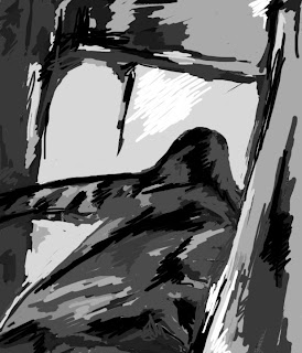
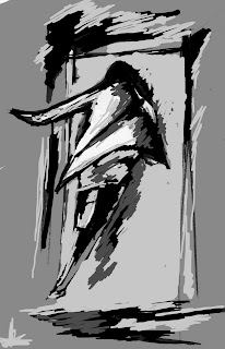
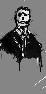
These are the designs that I created for the storyboard.
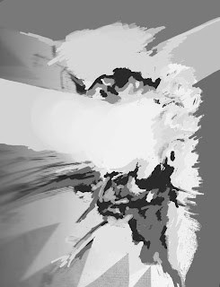
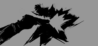
boom

eyes

gun

man running close

man running

president

president 2

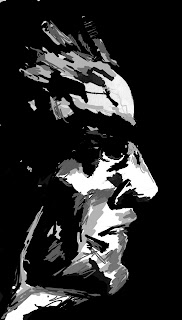
listening to silhouette (president is going to make speech)
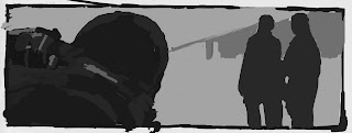
These are just the basic designs that I have created. The style was influenced by the metal gear solid concept art that I have. I wanted to keep the images gestural with grey scale block colours forming the shape.

I then layed the images out in the order that I wanted. It ended up being put across three pages because it flowed better that way.

 These are the three finished pieces. I wanted the first two to be in black with the greyscale because it is known as the linear part of the narrative, basically he cannot travel in time at this point. In the third piece it moves into red because he has travelled back in time. This is not reflective of the game but rather a technique of showing it is in the past. I like the red more than the grey, which is annoying because I would like to make the first two red as well.

Thursday, 18 November 2010

Digital painting lesson

I need a tutorial with Nigel in digital painting using Photoshop. This is the weakest part of my portfolio so it really helped. I learnt to use basic tools in Photoshop that I have never used before.

An important tool I learnt to use was the History brush. This really helped me because I have alwasy used the magic wand to select parts in the same layer. The history brush and the eraser allow for areas to be painted and removed with precision.

I also learnt how to manipulate an image and apply it to a screenshot of A Maya file. This is extremely helpful because I do not have the time to texture A concept in Maya. 

This is the first image I created using an image of a building in new york. I altered it to fit the building using the distort tool. I also painted over the image to apply lights.

Here I changed the images hue and saturation. Also I changed the brightness/contrast. I think the image looks good but it is not relevant for the concept. The image is meant to be a prison so a skyscraper is not the right aesthetic. I used this image just to see if I could create something from what I learnt from Nigel.
Here i changed the image to try and make it look more like a traditional building.
I then changed the brightness/contrast and applied paint on a new layer to darken the image.I cannot finish the image because I need to start working on the game document. I created this design to show the idea rather than have a finished concept.

Thursday, 11 November 2010

My first animation


(Refer to animation 1)

I mentioned on the last post that I would not be able to create an animation for this project, but I was wrong. I didn't realise how fast a basic animation could be created using Adobe Flash. I found a tutorial on YouTube that helped me. 

I am reasonably happy with the results of this animation considering I have never created anything in flash before. I think it could be smoother which I could do but it would take a long time and I don't think it is necessary. This shows the basis of my concept which can be developed at the end of the project if I get time. 

I think this animation would be greatly improved if I could zoom in and out and pan with the camera to follow the movement of the white silhouettes. I imported the animation into after effects and tried to create a pan. Again I have never used this program so I found some tutorials on YouTube. 

(Refer to animation 2)

Considering this is my first use of After Effects I thought it went reasonably well. The problem I did have however was that the animation and the pan had to be set to the same speed which is tricky. Also the smoothness of the pan could be improved but I think it is a good start.

(Refer to animation 3)

Here I added zoom to the animation. As a whole I think it looks cool and the idea is good but it could just be executed better. The quality isn't very good because I converted the original flash file into a AVI file and it lowered the quality so I will be able to improve the quality next time I recreate this process.

Wednesday, 10 November 2010

Story Board

I wanted to use the images that I have created to make a form of story board.

I didn't want to create the basic layout for a storyboard so I thought I could use images like this to show the action of the game. This is just an example of a storyboard but if I develop the idea it would develop much like a comic. The issue I see with this is identification of characters. Now I think if it, that would be extremely hard. Characters would have to have an identifiable feature that is visible from a silhouette. I will try it anyway using the main character to show what the action could consist of in the game. If I can't use this as a storyboard I could use the same idea but create detailed drawings rather than silhouettes.

At the very least this could be a poster...

Going from the poster idea I created this using the same concepts.

 
I have had time to think about it and I think this concept would make a great animation. The white could spread like ink with the camera zooming in and out. The white would form the shape of the first silhouette and then change into the line and progress to the next silhouette. The camera could pan along with the line while it is being formed and text could sit on the line. This would make an interesting advertisement. I don't have time to develop this idea but if we do carry the project through for the next brief then I may be able to develop it then. 

Silhouette problem

It is hard to know what an image is going to look like when it becomes a silhouette. I created a drawing of a man flying through the air because he is being shot. It looked good as a sketch but when I removed the detail it became a blob. I may try to use it anyway but change the shape, at the moment I am undecided. I will be adding the man shooting him which may put it into context.


Certain things do not translate as well when they are a silhouette such as hands and feet. Hands are hard because of the placement of the thumb can make it look strange. 

I have decided to recreate the man being shot. Before I have created sketches and then filled them in. This time I will just draw the basic shape of the character. This may not look as convincing because there will be less detail but it will be a faster process. 

This is the finished image. I am happy with the results. I hid the 'shooter' in the background which looked better because it adds a subtlety to the piece and adds relevance to the background. I added a blood splatter against the mans head with a crimson colour which may be stereotypical but I think its looks good and adds to the narrative.

Whoops!

I decided to have a break from the Maya work for the day and create some character ideas. Rather than look at what the character looks like I thought I would concentrate on how he would move. I started creating basic sketches on Photoshop. I was working on one piece and I accidentally selected the wrong thing with the magic wand. I then painted over the sketch without realising the mistake. I received a result that I have never done before and I think the aesthetic is interesting.

I may try to develop this idea because it links well with the noir style that I have been using.

 This is the same image but I used a few different brushes for the background. I think this looks better than the original. I may now try to fill in the character with white. 


I like this piece because I think it looks quite epic. There is a lot going on which I think it makes it look like the character is moving. I may try to create several pieces like this with different movements. I think this aesthetic could work well as an animation with the paint moving to form other shapes of the character.

Tuesday, 9 November 2010

Bridge concept

I was thinking of a good environment that would be relatively easy to create that would lead up to the prison. I thought of a bridge because then the prison could be surrounded by water which would make a nice mise en scene during the game.

To start the bridge I started to create a support in Maya. Ignoring logic I thought I would create this and then go from there rather than plan with some sketches of the bridge before I started the Maya work. With no real direction I created this support.


This is not finished obviously but its a good representation of the shape that I was trying to achieve. The idea for this was that there would be two of these on either side of the bridge supporting it. It would have a futuristic aesthetic but not so excentric it looks stupid. 

This was the next stage of the design. I finished the general shape and filled the hole. It is starting to look like what I imagined but it looks like a piece of furniture so I will need to make some changes. 
I thought it might look cool if I crossed the two pieces to form an x above the bridge. The shape of each piece makes it look strange. Again it looks like furniture so I will change the shape and see what happens. 


Here I removed the strange quiff part half way up the structure. I think it is better than it was but I am still not happy with it. I am beginning to think it is the wrong shape for the idea that I have and I should probably start again but I don't want to view the time i have spend on this as a waste so I will look for other ways to use this piece. 

I was messing about with it really and I came up with this;


I like the aesthetic of this so far which is the important thing even though it has no relevance at the moment. It can have several different possibilities for its application though such as a building, or a monument, or an architectural detail for a building. I will develop this idea and see where it takes me. 

Sunday, 7 November 2010

How many faces?

I decided to improve the face count on the prison concept. I have decided I want to see it rendered to make a decision where to go from there.

This is the model before I made any changes;
Bad poly count
 The model after the changes;
With squares and rectangles it is easy to remove the edges in Maya to create one large face.

Prison concept 1

As I have already mentioned I want the present to be set in a prison. This is the scene that I have the most amount of ideas for so I will start with this idea.

This is a screenshot of the environment in maya. I will not be rendering this idea because I will create other ideas that will more than likely take me down a different route but I think it is a good start.


I created the bridges to make the building look menacing while providing and idea to the gameplay possibilities.
The polygons are a mess on this environment but I am not bothered about this because it will not be developed any further. I would tidy it up if I were to take it further.

Escalator concept

I found an image from google of an escalator that inspired me to create a design similar. I just thought this looked brilliant. I really like the curved supports for the roof.


I created a quick model in Maya from this idea.


This is a basic representation of the picture but it could be adapted into an entrance for one of my environments.

Thursday, 4 November 2010

Bad News

I have just found out that a back to the future game is in development and will be released quite soon. What are the chances of a game being created 20 years after the films release while I am developing a similar concept. I will look into the specifics of this game and see if the concepts are alike. I may possibly have to change my idea due to this.

Concept art for back to the future game

Stand up look sharp

It is the day of the presentation. I am a little nervous but I think I have rehearsed sufficiently. I have decided to wear a shirt and tie with nice jeans. I think you cannot look overdressed in these situations because it shows you are conscientious.

I just got back from the speech and I believe it went quite well. It could have been better but I don't think I made any major mistakes in the pitch. I mentioned everything I needed to and I think I was coherent throughout. My tutor Nigel asked one question which I could answer easily because it was originally in the pitch but I removed it because of time issues. The time of the presentation was about 8 1/2 minutes.

Saturday, 30 October 2010

the sell sheet

I created a sell sheet for the pitch which contained all the relevant information about mmy game idea. I wanted to incorporate the narrative into the aesthetic of the sell sheet. I decided to base it on a newspaper which had statements and images that relate to the narrative of the game. I wanted the paper to include the idea of film noir in its look.

My newspaper sell sheet

After reviewing the sell sheet I now see weaknesses in its appeal. In all honesty it was rushed and I think that is evident in its finish. I like the art work that I created for the sell sheet. The Font of the newpaper is the same as the presentation which I think was important to make it connect with the presentation. I think the general layout could have been improved although it was hard to create anyway because the statements about the game had to be a clear focal point. At the top I created three extra signs which originally I liked because it made it look like a newspaper, however I have realised the one in the centre makes the newspaper look like 'the extra' suggesting its name which is misleading. Realising these mistakes now is good because I can create a better sell sheet when I made another speech.

Friday, 29 October 2010

The pitch: take 2

I thought there was not quite enough for the background of the presentation so I added the logo and brought the opacity down.


Finished slide

The Name

I have been thinking about the name so I can create a logo for the pitch. I have come to the conclusion of using FATE. I chose this name because it fits with the narrative and well it sounds cooool. I used a font from 1001fonts.com for the logo and edited it in photoshop.

I wanted the font to have a futuristic feel to it and almost seem mechanical. I think this font conveys this idea quite well. The shape around the E is from the first concept I created of the eye.

The pitch

This project has been leading towards the dreaded pitch at the end of it. I recently saw the last years pitches that were caught on camera. I think overall they were quite good but they all had their weaknesses. I think the one thing I am worried about is getting nervous and forgetting my words. Maybe a slight bit of irony getting nervous about becoming nervous. I have used the concept work that I have so far to create a background/border for my powerpoint presentation. I am quite happy with the results so far even though I have been told by a tutor not to use a black and white presentation. I think it was better to do this because it fits nicely with the narrative.

Thursday, 28 October 2010

Concepts

Robotic eye
This the first concept I created when I was thinking about time travel. There is a subtlety in the suggestion of the person having robotic characters which I like but I think the skin could have been utilisied better. The red cirle in the centre of the eye is a nice characteristic I think.

I began to create character sketches using photoshop and came up with these two images. I like the hoodie on the character making him appear quite dark although it would make it hard to show emotions while in control of the character.